Blogger recently updated their user interface. In the process, a few default settings changed in ways that are worth being aware of.
Let's take a look at a few of these options.

Normal Text
One of the changes I noticed first was a change to the default text style. Blogger now defaults to Paragraph style. This introduces automatic breaks between paragraphs, and possibly a few other quirks. Personally, I like to decide on my own spacing, so I prefer to use Normal style text.
You can see the dropdown menu to make the change in the rather meta image above.


Published Date
In the past, Blogger defaulted to an Automatic "published on" date and time. Basically, whenever you clicked the Published button, that's it when it was time-stamped.
Now, Blogger defaults to the Set Date and Time option for time-stamping your post. And the selected date and time defaults to whenever you last revised the post before your current writing session.
If you write your post in one go, and relatively quickly, this change won't affect you much. But if you write a post in a few drafts, or spend several hours between when you open the post and when you publish it, then your blog post will be incorrectly time-stamped ... which means that your newly published post will show up somewhere down in the middle of others' blog rolls, rather than up at the top where your new work belongs (until someone else hits publish and supplants you!)
You can see how to change this in the image above. I first started writing this post on September 29th and finished editing that night a little after 7:30 pm. And as you can see, that's still what time Blogger wants to use for the time-stamp. Get the correct timestamp by switching to Automatic.
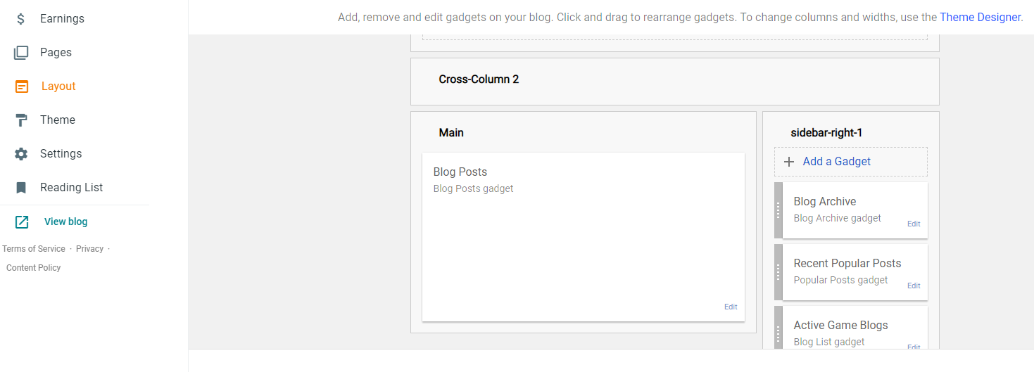

Navigating Your Archive
This last issue doesn't have to do with writing and publishing posts, but it does affect how easy they are to find after you finish them. My blog's archive is set up so that each post gets its own entry, organized by month and year. You can easily click the arrow next to a year to reveal all the months I wrote posts, and click the arrow next to a month to reveal the titles of all the posts I wrote.
Recently, I've started seeing blogs where the archive only lists the months. There's no way to see a list of the post titles. The only way to navigate is to click on a month and then scroll through the posts themselves. That's not a very good option. If you'd like people to find your older posts, please change Blogger's archive setting to make it easier on your readers.
Here's what to do. On your behind-the-scenes page, click the layout button on the right. Find your Blog Archive Gadget and click the Edit button. The Flat List option makes it too difficult to navigate, so switch over to Hierarchy. Make sure to click that box to Show Post Titles - otherwise you'll defeat the purpose of this configuration. I also prefer to archive the posts Monthly, and I recommend it for you, too.
If anyone else is thinking of writing a post like this one, I'd love to see someone graphic design experience talk about Blogger's aesthetic options. There are a couple blogs I follow that are rendered almost unreadable by the writer's graphic design choices. I think we'd all like to know how to make sure our own blogs aren't made illegible by a few poor graphic options.
I agree that the change to Paragraph formatting by default is more annoying than helpful, and that Normal is the way to go.
ReplyDeleteThanks! I'm glad to hear I wasn't the only person annoyed by the switch!
DeleteI have been composing my posts in HTML myself, so fortunately the default text style changes didn't affect me - but the change from Automatic to Set Time and Date stamping is just stupid, and I probably would've missed it until it was too late, so thanks!
ReplyDeleteIf you know how to do it, I suppose that composing in HTML is a bit like preparing documents in LaTeX. Perhaps a little extra work, but much greater control over the output.
DeleteI'm glad the timestamp advice helped!
Lol, thanks for this. I wondered what the heck was up with the formatting of some of my recent posts. That time stamp change is bizarre. Why make changes like these?
ReplyDeleteI'm guessing that some of the changes are supposed to make the interface more phone friendly? Replacing the list of posts in batches of 50 with infinite scroll seems like it's supposed be for smartphones.
Delete(I kind of hate that though, because it's impossible to jump ahead without going all the way through. Maybe not too much of a problem for posts, but suppose I discover an old spam comment I want to delete?)
As for the other changes, I have no idea who thought they were useful or helpful in any way.
I agree that the new interface is very mobile-oriented. It's a bit perplexing to me; do blogger's users really write proper blogs (vs tweeting) on their phones?
Delete*very* useful post, thank you. Far more so than my most recent one ;)
ReplyDeleteOn the other hand, you organized and are gradually putting out The Foreboding Fromagerie, which is a pretty cool community project!
Delete